Dark and light mode blog images with MarsEdit
As dark mode is more popular than ever now that the iPhone supports it, I’ve been working out how to get the browser to render a dark image in dark mode and a light image in light mode.
It turns out that the way to do this simply is to use the <picture> element like this:
<picture>
    <source
        srcset="/wp-content/uploads/2019/11/example-image-dark.png"
        media="(prefers-color-scheme: dark)"
    />
    <source
        srcset="/wp-content/uploads/2019/11/example-image-light.png"
        media="(prefers-color-scheme: light), (prefers-color-scheme: no-preference)"
    />
    <img src="/wp-content/uploads/2019/11/example-image-light.png"
         alt="Description of example image here"
         class="border" loading="lazy" />
</picture>
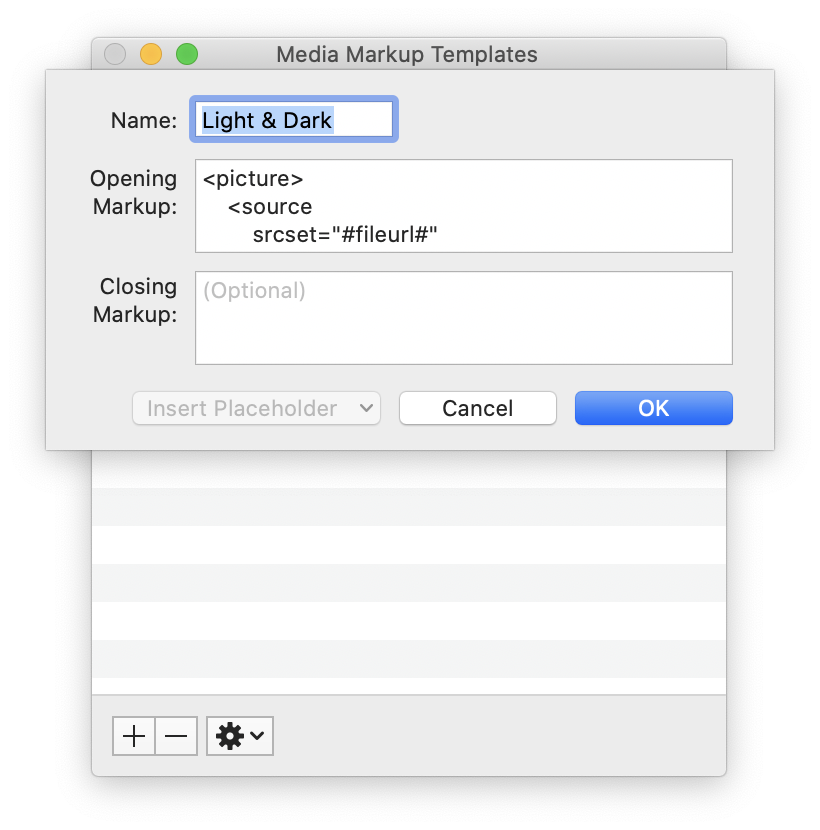
As I use MarsEdit to write my posts, I created a Media Markup Template that does the heavy lifting:

The template looks like this:
<picture>
    <source
        srcset="#fileurl#"
        media="(prefers-color-scheme: dark)"
    />
    <source
        srcset="#fileurl#"
        media="(prefers-color-scheme: light), (prefers-color-scheme: no-preference)"
    />
    <img src="#fileurl#" loading="lazy" alt="#alttext#" class="border" width="#imgwidth#"/>
</picture>
It’s essentially the same as above, but with MarsEdit’s placeholders. I manually remove the class="border" if I don’t want a border on this image.
I can now drag an image for light mode into the MarsEdit compose window and it fills does most of the work. I then upload the dark mode image, update the URL for the first <source> element and I’m done.
If I’ve done it right, the screenshot in this post will be light or dark depending on the mode that you’re viewing this page in. Next, I need to work out how to get my syntax highlighter to honour dark mode!


